

Case Study: Vudu’s Living Room App - Product Detail Page Redesign
Any process I formulate has a foundation utilizing three strategic fundamentals:
Who is the customer?
What problem are we trying to solve?
What is the outcome?
That being stated, the following is an example of a typical process I undertake in product design.
I should preface this, though, I’m highly adaptive to appropriately align the “right” process for each project. This means small projects that can be produced in a few days should not be inundated with excess management suited to more extensive, high impact projects like this one. Point being, regardless of size, the chosen method should still address the three core fundamentals.
Regarding this example, the Vudu product detail page (PDP) on living room applications was long overdue for a redesign. Initially published in 2014, in 2019, a small “journey team” set out to modernize its design, improve the user experience, and uplift sales conversions.
Process

My Role
Product Design Director
Project
Redesign Vudu’s living room product detail page
Platform
ROKU, Smart TV & living room device apps
Team
Myself, Product Manager (1), Sr. UX Designer (1), UX Researcher (1) & Engineers (2)
Original Design
When users open the Vudu application on living room devices and then navigate a television show or movie's detail page, this is the legacy layout and design.


Research
User Problem
Multiple UX fail points
Dated design - 6 years old
UX Research
Performed heavy competitive analysis
Ran surveys and remote studies
Only 43% of users satisfied with the UX, where the Vudu product average is 70-90% UX satisfaction
80% said it is hard to understand
70% couldn’t find the sub-navigation the 1st time
Analytics
Most popular page in the application w/ XX% of all page views
A tremendous amount of revenue derives from this page XX%

My role: I directed and assisted our UX Researcher in the planning and execution of pre and post UX studies to gain quantitative + qualitative actionable data insights.

Project Goals
After reviewing the UX research, competitive analysis, and analytics, the conclusion was to improve the following measurable goals.
Lift conversions, retention & time on page
Enhance usability, efficiency and information architecture
Modernize look-and-feel
Improve UX satisfaction
My role: I collaborated with the product manager to organize the research findings, document product requirements, get development level of effort estimates, establish timelines, and pitch stakeholders.

My role: I led the ideation. I’ve used multiple frameworks in my career, but enjoy this one. It’s highly useful to treat stakeholder monologues and allow every voice to be heard.
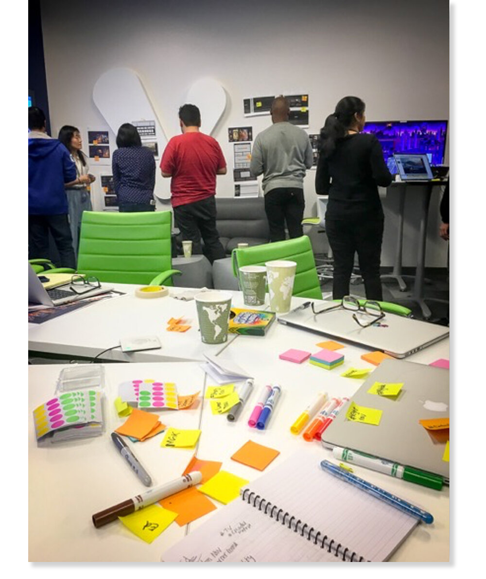
Ideation / Brainstorm
We invited multiple engineers, designers, researchers, and executives to participate in an ideation framework called Diverge > Emerge > Converge.
Ground Rules
Bring it! No idea is dumb
Sketch, write, whiteboard
Avoid “yeah-buts”
Timekeeping
Time (Approx. 2 Hrs.)
INTRO: Explain agenda (5min)
DIVERGE: Idea exploration & sharing (30-60min)
EMERGE: Categorize & dot voting (15-30min)
CONVERGE: Group discussion & consensus

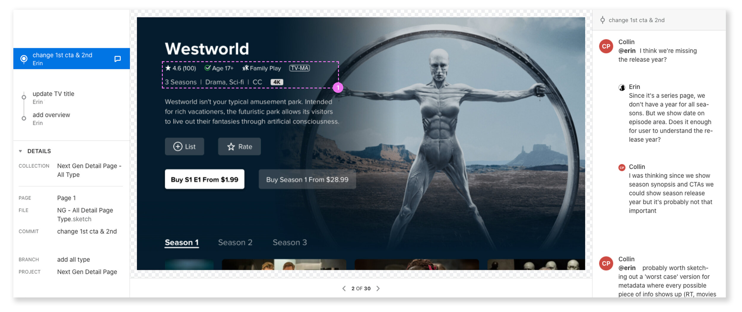
Communication
I like to hold digital discussions for micro-conversations about design directly on wireframes and graphic mockups using tools like InVision and Abstract to expedite collaboration. The screenshot featured here is Abstract, which is also used for Sketch file “single source of truth” source control.
My role: I participate in the conversation to offer design support, aid in project management, and help ensure project requirements were being adhered to.
Early Design Explorations
The first few rounds of design did not adequately address all of the documented UX fail points. In multiple hallway tests and several remote sessions on UserTesting.com, users were still finding the navigation challenging and experiencing information overload.
My role: I ran several whiteboard sessions, personally designed a few mockups, illustrated some graphical elements, and helped UX research run studies.
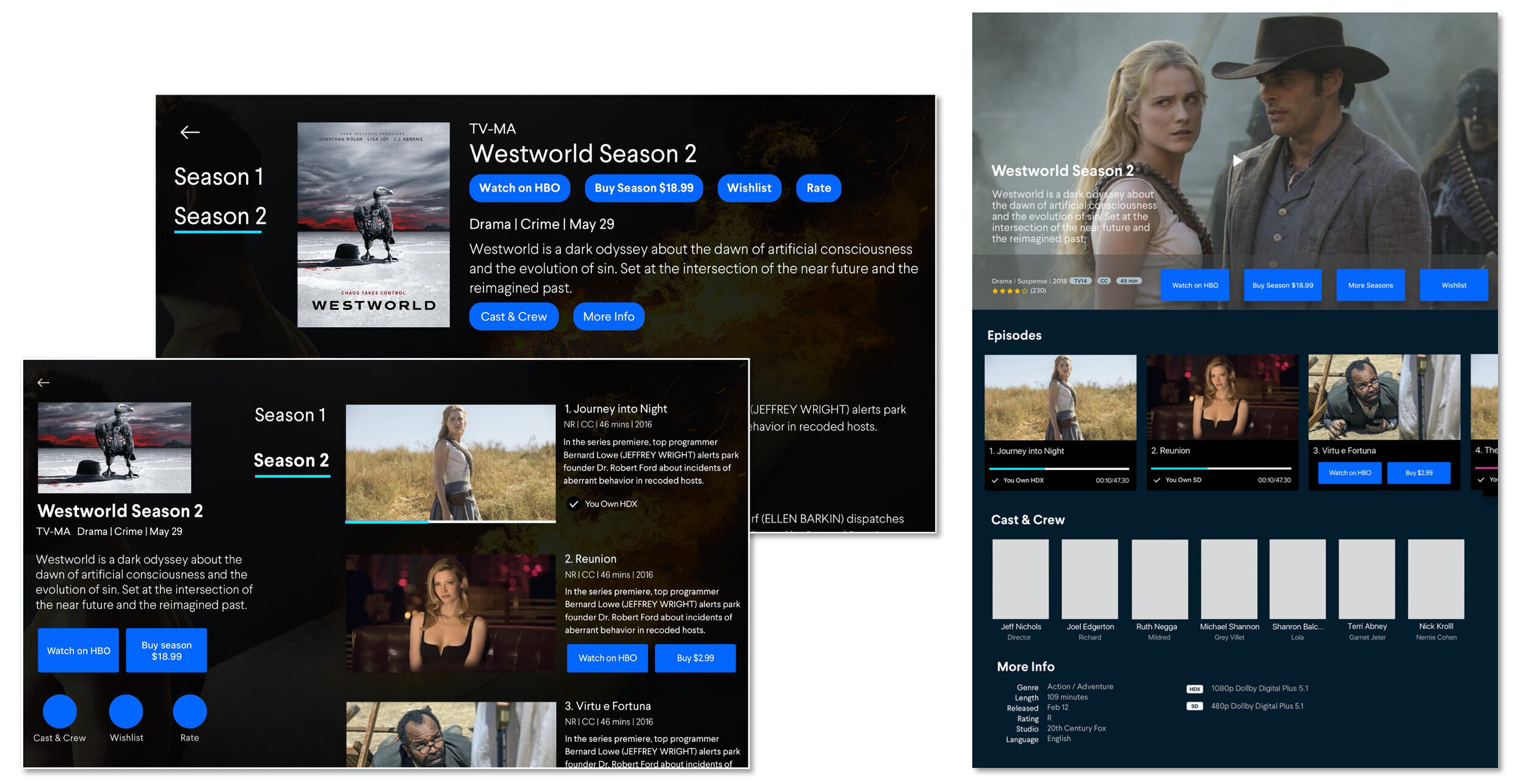
Improved Design
After multiple iterations, three designs rose to the top, resonating with our team and customer tests. Several lessons were learned along the way, including:
Keep the layout clean
Use the fold to address visual design/information overload. It’s ok to scroll up and down. Even with a d-pad remote (up/down/left/right). No need to cram everything onto one screen.
Up/down remote cursor movement was more comfortable than left/right.
High impact visual imagery increases click-thru rates. Showcase big and beautiful content images.
Push less desirable metadata like cast and crew and parental guide away from initial view. In information hierarchy, not everything has equal weight.
Prominently place tier 1 CTA’s like buy/rent and keep a second focus on secondary CTA’s like list and rate.
My role: Same as the early explorations.

Critique
After several design iterations, I like to hold “crits.” These 30 min to 1-hour meetings are fully open to stakeholders, engineers, designers, and others with a vested interest to review designs in either mockup or wireframe form. Crits give key partners the chance to preview work, offer suggestions, voice opinions, address development considerations, and gauge level of effort.
My role: I help moderate to facilitate a positive discussion while letting the designers and product managers host and showcase.

Outcome
We elevated user happiness and numerous aspects of the design.
Improved IA & navigation
Increased purchase click thru rates
Ratings uptick:
+ 28% satisfaction (43 to 71%)
+ 49% page understanding (20% to 69%)
+ 46% navigation usability (30% to 76%)
